Categories
Game design analysis

Visual help in Monster Hunter Portable 3rd

Deciding to play a game completely in Japanese is not a decision I take lightly. In fact it’s a decision I’d rather not make at all. More often than not I (and many others like me) find ourselves importing a game simply to experience a game that doesn’t have much hope of making it to our region.

I imported Monster Hunter Portable 3rd (and it’s HD equivalent on PS3) at the beginning of this year for just this reason. This was at the peak of a frustrating drought of Western Monster Hunter releases, so the decision turned out to be a favourable one.

Despite the frustration of the release though, if you’ve played a Monster Hunter before, you’ll be right at home, and that’s because of how carefully designed Capcoms seemingly busy interfaces are. Strangely this isn’t something I really noticed until I could no longer read the words – a great litmus test of gameplay usability.

Why play in Japanese?

There are many reasons why this most recent title has yet to reach anyone in the West. The most prominent being the lack of true online support for Monster Hunter Portable 3rd. Many Japanese gamers still prefer to play Monster Hunter’s multiplayer in it’s original format, using cooperative play in person rather than online.

Since I am unable to play online at this current time, returning to Monster Hunter Portable 3rd every week or so (in another language to boot) is an ongoing gaming project (and another example of good old fashioned local cooperative gaming). While I’m aware of the fan-made project to play the game in English. My Monster Hunter partner and I decided from the get-go to play the game as intended.

Helping you visually

I am surprised at how competently we are able to manage playing Monster Hunter in another language.

This isn’t mere familiarity with the series, Capcom employs some very smart game design principles to make what can be an obtuse game very understandable by a foreigner.

The organisation of hunting quests by rank/difficulty has been present since the first game, but Portable 3rd improves this, by shading the whole quest element the appropriate colour. Generic quests in blue, and urgent quests in red, Gathering in green etc. The combination of ranked star system and numbers used to denote higher level quests becomes particularly helpful when you understand no Japanese.

Where the game really comes into its own though is its use of colour. The game is great at using colour to denote positive and negative effects. You can work out from skimming the quest list a) where the quest takes place b) how many monsters you’ll be fighting and c) what the rewards are for that mission.

Reviewing the quest list.Three monsters are indicated for the next quest.

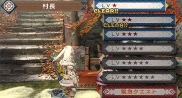
This great use of colour works all the way through the game, from the good/bad status effect icons, the skill effects on armour right the way through to showing which items are returnable supply items in yellow.

Making sense of things in the heat of the moment

Overall Monster Hunter Portable 3rd continues this theme of visual accessibility by not changing the fundamentals of the series more improving the established elements that work, such as the menu and ability to skip between rooms. It’s very easy to commit to memory what all the functions of the menu do. In battle, I find myself flicking between my combine menu and quest info easily.

From the in-game battle menu I find I am using the iconography for the items used, far more than I did in the English versions of Monster Hunter. In the heat of the moment I search for the right icon I need first, then double check the Japanese secondarily to make sure that I have the right item. Capcom reuses colours and identifiable icons here to (usually) help distinguish one item from another).

As a bowgunner, ammo is the only area where I find I have had to learn some Japanese. Each non-elemental ammo type has three different grades, so occasionally I find I can muddle up pierce and normal ammo when I am reloading. In fact ammo is the only occasion where this careful colour scheming can fall down – colours are reused not just once but more, the worse example is the use of red ammo being used for fire, tranq, dragon and demon shot.

The colour schemes per monster make items really easy to distinguish.Hunting lizards in the volcano area.

Gathering items and collecting monster parts however is helped by the colour schemes – despite the fact that they are reused as with ammo. All the large monsters you hunt have their own unique shading of the item parts, this together with the monster item icons makes it easy to tell a Tigrex claw from a Rathian webbing.

These colour schemes are used for every item, from bombs, to insects. Making the process of collecting and finding the appropriate item easy to do.

Picking out important messages

Visuals aren’t the only way that the game supports familiarity though. There are careful audio moments where (such as the song sung when meat is cooked correctly) and the icon prompts from your felyne companions that do transcend the language barrier. The rare moments where some English does creep in is appreciated. This ranges from the reloading messages on bowgun ammo, to success messages such as “quest clear” and “hunter rank up” notifications. I suspect the decision to put these particularly important statements into English was a way to make them stand out. As someone who doesn’t understand any Japanese, they are a welcome reward to my hunting.

Audio cues continue to be useful through battles and general play. Success cues help support the messages I cannot always read, such as telling me when a monster has spotted me (by the battle music starting up) or when my supplies have arrived, or my supporting items worn off. This is most evident during something like combining items – particularly in the heat of battle. The audio cue quickly tells me which items have been successfully created, and how many failed without having to look at the item(s) in detail, this often saves precious seconds when things aren’t going as well as I’d like.

English is used in key places such as the character creation screen.Creating a new bowgun reveals a list of items required.

A fan of localisation

Above all though, this is a game that has been made possible by a Western audience by the ever-impressive Monster Hunter community. Fans have translated the game into English for those who wish to do so using custom firmware. Most importantly for me though have have created a series of online resources which have been able to help me get started. From everything to explaining new tutorial and drink quests that are new to this Monster Hunter entry, all the way through to weapons upgrades and armour creation.

Weapons and armour creation are one of the few areas of the game that are trickier in Japanese. In this iteration of the game I have to plan out what I wish to create and build things far less on a whim.

As enlightening and enjoyable as this Japanese playthrough of the game has been, it has fallen to the fans of the series once again to expand the intended audience. Capcom’s usability improvements in this iteration of Monster Hunter shows that is an evidently very playable despite a lack of Western release. I only hope that this Monster Hunter drought finishes soon. I have a new-found appreciation of the localisation process.

Categories
Game design analysis

The heroines of Child of Eden

When I sat down to first write about Rez I considered analysing Rez’s story (rather than it’s graphical content) a challenge, but I now realise that I was buoyed through that piece of writing by my sincere love for the game. I feel I owe it to myself to attempt to analyse Child of Eden in a similar way.

Consider this a companion piece to my larger and more in-depth story analysis of Rez.

The second heroine

The first thing to note is that I have called this the “heroines” of Child of Eden. The influences of the original AI Eden are everywhere in this game. While she is absent, Eden’s influence is far-reaching.

It was Rez’s Area 5 that served as the conclusion to the original Eden’s story, as she looked at the vastness of space and time, and mankind’s influence on its timeline. Thematically in Child of Eden there is little such distinction, with each area imparting it’s own monumental epiphany to Lumi’s now virtual subconscious.

I believe that one of Rez’s primary focuses was the progression of civilisation and the “start” of mankind. If that’s the case, the Child of Eden is almost exclusively the opposite. And that’s not too surprising given the background of its heroine Lumi.

She was born upon a space station and destined (or so we are led to believe) to only examine the beauty of the world from above, never experiencing nature’s detail for herself. Raised in the modern, but stark environment of spaceships and stations. If you stop to consider this for a moment Lumi’s origin (in the context of this game at least) is quite a sad story. This is backed up by the fact that it’s barely touched upon. The game instead steadies your focus on her virtual inception rather than her origins. She is a celebrated, but obviously quite isolated figure. So it’s not too surprising that she embraces her brief, but new-found freedom within Eden.

Lumi looks around at the landscape.Lumi looks at the camera in terror.

And she experiences it with all the vigour and terror of her predecessor.

All the memories and experiences of the population of the modern internet are there for her to experience first hand – in the only way she knows how to interpret them – via the framework of space travel and exploration. She is backtracking in parallel to Eden’s older exploration of the Earth and the wider universe. Except Lumi focuses on the present and future rather than the past as Eden did.

The virus

Lumi also takes obvious enjoyment from on the natural aspects of life on Earth, only briefly venturing into areas of science and technology. These moments could be interpreted as the intrusion of Eden’s understanding of the world. As Eden focused on the civilisation and learnings of man, rather than their environment, as I mentioned previously:

“What is clear is that Eden is beginning to analyse all that has come before her, trying to understand the world from the people who asked the first questions, wrote the first stories and began to shape our understanding of the universe in doing so.”

Lumi returns to this principle many hundreds of years later, except she attempts to explore the world she couldn’t while she was alive. It’s environments, landscapes and creatures, with a careful mixture of her own knowledge and experience of confinement in space.

Bright, butterfly-like creatures over a river.Fighting for Lumi's survival above the Earth.

If as I wrote in my Rez analysis the virus that beleaguers Eden is her own expanding self awareness, then Lumi’s seems to be the intrusion of the darker elements of mankind venturing into her new and pure existence. Imagine all the evil and seedy aspects of humanity, combined with it’s detailed and expansive records of all that is ill from the modern internet.

I think for someone that has analysed Rez as much as I have, that might be why I find Child of Eden a little jarring compared to its predecessor – despite its obvious beauty – it is focused on a heroine that is coping with her almost unnatural rebirth. Lumi is an original, actual person rather than an AI gone sentient. As a result I found Eden’s awakening more uplifting and less bittersweet.

If, as (mentioned in my Rez article) the premise of Rez was to stabilise Eden in a mechanical sense, along with her new found humanity, then Child of Eden is focused solely on the emotional wellbeing of Lumi who is essentially travelling in the opposite path to the journey that Eden made originally – a human entity learning how to be an AI.

Secondarily, she is also learning what it is to be human, as she previous lived a half-life. Adored by the population of Earth as she shared her experiences through song, but unable to completely relate to their experiences of living.

The life aquatic

Personally the most intriguing element of Child of Eden for me is not its beauty, but the narrative theme it continues from Rez. Both are games heavily imbued with the themes of water, as mentioned in my Rez analysis.

“Eden’s recreations within the areas of the civilised worlds are beautiful interpretations of the information she has to hand. She presents an optimistic view of the old world – and the keystone of each area is a river – the surrounding fertile ground allows basic life to thrive, as a precursor to man’s development into a culture. This goes some way to explain the fixed track the player follows.”

Child of Eden in particular has an aquatic theme, the pace of the introductory video feels as though it’s happening underwater, and the game uses the imagery of water in its opening level (Matrix) as the player sinks through wide caverns in order to rescue Lumi. Vast images the sorts of bubbles created in diving are projected on the walls as the player is surrounded by shoals of fish, and other underwater beings.

Looking into a deep hole surrounded by air bubbles and fish.An underwater city separated by a river bed.

It is through water that Lumi realises her origins, glimpsing the Earth after her virtual revival. It is from water she is woken, as this is an apt metaphor when considering the makeup of the Earth, and how the land constitutes a small percentage of its contents. Lumi rightfully changes between views of the world from above (her limited, but comfortable understanding of the Earth) and the aquatic (a metaphor for the larger, darker and harder to understand elements). This starts in Matrix, but developments into the second area (Evolution). Rez’s focus on civilisation can be glimpsed here in the form of its underwater citys, with thousands of “buildings” separated clearly by a riverbed. But it is area three (Beauty) where the theme of water reaches its obvious climax. Waters life giving effect is the backbone of both games.

Rez ends with a horde of butterflies exploring a body of water, and in Child of Eden this river widens. If Eden soared above the oceans, Lumi struggles deep in its depths for most of the game, until the moment she is freed. She can continue to stare unnervingly down at both the Earth (as she did in life) but this time look fearlessly into its deepest, blackest water, while realising she is finally no different to any other person sharing their story through Eden.

A magical tree lit against a starry sky, with hundreds of photos in its branches.Lumi rejoices against a backdrop of water.

Categories
Game design analysis

Deadly Procrastination

Often Deadly Premonition is described as a game that’s “so bad it’s good” and as I groped to categorise this game it’s certainly a metaphor I used in the past. Upon finally playing it though I’ve realised that Deadly Premonition is utterly indescribable, pressing very different buttons for three distinct audiences.

Those that plain dislike what it does thematically, those that play it as a tongue-in-cheek parody, and those that completely appreciate the depth of its ambition.

I’m firmly in the latter category.

What Deadly Premonition does well

I think Deadly Premonition works because it attempts (and largely succeeds) in dabbling with subjects that most video games wouldn’t dare touch. I admire how it places humour alongside some really grisly subjects that you simply wouldn’t expect within the framework of a game. Cleverly it often mentions these grim subjects by hinting at the extremely dark backbone to the game without being inappropriate.

Cost of the game aside (it’s usually less than £20 new) there are few full-price games that even attempt the level of maturity that Deadly Premonition has, while also deliberately relaxing the player with its wry sense of humour. That’s the real beauty of the game; to emotionally involve the player in the motivations of its characters to the point of invading their “personal space”, while never feeling like it’s gone too far.

York thinks about the previous day in bed.Emily says how she's interested in finding out more about Zach.

Humour and intrigue

Agent Francis York Morgan is a remarkable lead character – a true mystery. A puzzle that we as a player slowly unravel throughout the game. We’re encouraged to delve into his mind through his audiable conversations with Zach. It’s an intentional story mechanic but hardly ever feels contrived. The identity of Zach is something that the player will stuggle to grasp for most of the game; as you eventually become more atune to York’s often bizzare (yet touching) conversations with an unseen person, you get more of an insight into the decisions behind his often brash personality.

Are these conversations meant for you, or someone else? They feel profoundly personal, occasionally breaking the fourth wall, sometimes awkward to hear, sometimes heartwarming, but always fascinating, the main reason to play is to understand York (and by association Zach) more. The answers the game eventually gives will not disappoint.

York looks over at Emily.Engaging in combat in the other world near the gallery.

A massive, immersive world

The development of York doesn’t mean that the supporting cast isn’t equally fascinating. In meticulously researching American towns to create the fictional town of Greenvale, the game’s creative team have tapped into what makes a living and believable open world. What is remarkable is that they managed this without the budget of other larger games.

This is primarily because of how involving the rest of the characters are, with each one adding another dimension to the town. The quiet normality of Olivia and Jim, the outspokenness of Carol and Becky. Polly’s hearing problems, Signorney’s troubling obsession with her cooking utensil. Every one of the 30 plus strong cast is memorable, fully dimensioned and easily describable without relying on caricature.

A typical red room menu screen, complete with deer.Polly and York sit on either side of a very long breakfast table.

The usability issues with the game are well known; the lack of a coherent map, and the often clumsy controls are the biggest bugbears. There are tons of things I would improve about this game, but at the same time, I’d be wary to tamper with the balance of it. It smacks of a development process that developed organically rather than in a much more sterile fashion. The result is a fabulous melting pot of ideas that makes it utterly unique and yet so utterly divisive.

By the time I came to leave Greenvale, it was hard to leave the world that had been carefully built around me. After completing literally everything I was able to do – it wasn’t enough – I wanted much, much more. Deadly Premonition is an utterly unique gaming experience. In fairness, (by reputation alone) it promises no less than that – no doubt to the chagrin of the majority of its intended audience.

Happily however, a handful of gamers will “get” the captivating world of Greenvale – a profoundly lucky few.

Categories
Game design analysis

The difficulty of Demon’s Souls

One of the most compelling reasons to pick up Demon’s Souls is it’s perceived difficulty. The game is supposedly as uncompromising and challenging as the games we grew up with – the games of our early childhood needed determination and above all imagination to play and complete.

In a nod to our gaming heritage, determination is the key requirement for Demon’s Souls; and if you “get” it’s carefully crafted design decisions, a unique gaming experience reveals itself out of it’s dark, foreboding gloom.

An unforgiving personality

Many games have a personality, successfully managing to disguise the fact that they were created from the minds of a team of developers, but Demon’s Souls sense of personality is particularly palpable. Primarily in it’s main theme; the insignificance of death. Your character is held perpetually under the thumb of the game, pinned into the swirling limbo of the Nexus (the game’s central hub). From there you are forced to meekly step out into five equally challenging worlds in your ethereal “soul form” to regain your body by defeating a boss.

In doing so you explore a crumbling world; a once great kindgom riddled with the dead and half-dead, as you avoid or kill the other beings and enemies locked into the ghostly spirit world with you. It sounds ghastly – as you step into the first world fresh from a bluntly ended tutorial – but Demon’s Souls magic is in slowly convincing you to the masterpiece of atmosphere it’s pulling you through.

Uzi's character takes down another person playing as a black phantom.The tower knight stomps down.

Joyfully the game is equal parts horror, puzzle, and action game. The first playthrough of an area will take hours, as you tiptoe along each path in terror, you will gain an understanding of how to master each level either alone or co-operatively with other phantoms. The controls are solid and as such you are infrequently annoyed with the game – only with yourself for making a mistake that cost you time and the chance to complete things. It’s a testament to how fair and balanced the development model of Demon’s Souls is, with every exploit, shortcut and time saving trick fully-intended by the developer.

Running through one of Stonefang's empty tunnels.A gold skeleton stands guard - while on fire.

A different approach

Demon’s Souls is also a community game which sinks or swims based on the frequency and reliability of the messages that others choose to leave you. It is the friendliness or apathy of the wider community which will decide whether you will be encouraged by another person, or spurned by those who seek amusement in the bleakest of worlds. Demon’s Souls true genius is in it’s ability to create empathy for another player experiencing the same (difficult) world, players are pushed to the point where they begin to understand the motivations of others who choose to play more dubiously.

Trying to backstab an enemy black phantom.A typical multiplayer screen with two summoned blue phantom.

There is a malevolent force running in parallel to your adventure, slapping the back of your hand as you make mistakes; a noise for a successful blocked attack, another for one that fails. This will infuriate you until you can eliminate your bad habits in combat and do better. So much of the gameplay is left unexplained, so you are left to make mistakes by dying in a trap, falling, or failing a one-on-one fight. You will fail moments continually with little encouragement until you either figure it out or do better. However Demon’s Souls makes you feel the master of your own destiny, you are left to explore and fumble through the game, growing in confidence as you slowly master it’s almost animalistic environment and begin to work out your own strategies to survive longer.

The red dragon flies over a vista of Boletaria.A typical equipment screen.

Demon’s Souls a usability nightmare at first glance

  • You can kill anyone

    Including any friendly NPCs in the game (accidently or otherwise). This can also prevent you from buying or using certain items or spells, or progressing certain story arcs.

  • There is no map

    Or mini-map or a guiding trail. Any exploration done in the game is done through trial and error or memorising the game’s landmarks and traps.

  • The menus can be cryptic

    It can be quite difficult to decipher the information in the menus, the icons that represent different types of damage are cryptic and lots of important information about how to increase damage using your stats simply isn’t in the game.

  • Little in-game help

    There is very little explanation of how to play after the initial tutorial, no way to review what you’ve learnt and no help with finding the key NPCs/locations.

  • There are no checkpoints

    So if you die in a particular area after a long, precarious journey through a level you have to start all over again.

  • The multiplayer features are quite buried

    It is quite difficult to arrange co-op play with friends without pre-arrangement using external voice chat and careful timing (or you risk your friends being poached by someone else).

  • Mandatory player vs. player

    If playing in body form (which is normal after defeating a boss) if you also decide to play online you may and will be invaded by other players attempting to gain their body form back by killing you. There is no way to stop this attacks other than playing offline or staying in soul form and no limit on how often you can be invaded.

  • Gets harder rather than easier as you fail

    Keep dying in a world in body form and enemies will become stronger, hit harder and drop less healing items. The game difficulty also increases with each new playthrough.

Killing the Flamelurker with a bow... as he was about to strike.Sage Freke says: I never expected to get out of there alive.

But there’s method in the madness

The choice to do this is a deliberate one. At the heart of Demon’s Souls is an experience which allows you to fumble, struggle – but learn. Very soon the style of gameplay struggle gives way to empowerment. Demon’s Souls is the wonderful exception to the rule – the boundaries set-up by the game are ultimately what defines it. This changes everything:

  • You can kill anyone

    So you become more cautious and aware of how precious the NPCs are, and value them more. Experimenting with killing NPCs on purpose depending on who you kill can effect the neutrality of the world, your character and open up newer and darker plotlines.

  • There is no map

    So you learn to memorise the level, and due to the excellent level design you are seldom left wondering where to go. This is supported by a set of solid controls and camera that mean that although you are frequently challenged by a level it feels completely manageable.

  • The menus can be cryptic

    So you learn through experimentation. Every enemy has a particular attack type, elemental or magical weakness, making the cryptic nature of the meuns more intuitive over time.

  • Little in-game help

    So you begin to learn the pitfalls and secrets of Demon’s Souls through the anonymous message system. There is a strong sense of community, fair play and support at the heart of the game, so it is other players – whether new or experienced – that become your main support mechanism.

  • There are no checkpoints

    But as you get more accustomed with the game you’ll be able to find and open the many helpful shortcuts and secrets more easily saving you battling through the same area over and over again.

  • The multiplayer features are quite buried

    So when you do manage to find someone else to play with, or you arrange to play with a friend the experience is remarkable, playing with others through a new area is one of the best ways to learn the tiny details of the game, or discover new strategies that may not have occurred to you.

  • Mandatory player vs. player

    As you play more you get more confident and this becomes less of a problem, particularly when you can invite two friends (or strangers) to even the odds.

  • Gets harder rather than easier as you fail

    And when Demon’s Souls really gets it’s hooks into you this is a blessing not a curse, with the confidence you gain through playing the game through once prepares you for the balanced upscale of difficulty.

Fighting five of Latria's prisoners in soul form.Standing before the Tower of Latria archstone.

Playing Demon’s Souls makes you realise the notion of a game’s difficulty is part design, part confidence in the player’s ability. In this game From Software presents you with a challenge, and if you have the optimism to look at the prospect of Demon’s Souls as an opportunity rather than a problem the experience will reward you tenfold.

Categories
Game design analysis

The usability of Final Fantasy XIII

Reinventing such a popular series of games will always lead to discussion, but what is clear is that FF13 marks the broadening of Final Fantasy; the balance between the ease of use for gamers that wouldn’t normally play RPGs and the die-hard fans.

If the intention was to simplify Final Fantasy, then I take issue with the some aspects of the games usability; here’s what it does well and what could have been improved.

What Final Fantasy 13 does well

Helpful “story review” loading screens

The ability to recount where you last were in the story is a welcome addition, particulary when the narration is even more character driven than in previous games. Upon loading the game you have the option to read through the last part of the story you played, immediately getting you up to speed with what to do next.

The story summary is brief, highlighting the main points of the previous cutscenes or major battle – while also highlighting any subtle points that the player may have missed.

In previous Final Fantasies coming back after a long break frequently meant starting over. It was often too difficult to remember where you left the story, the inclusion of recap screens are a great time saver, with the added benefit of hiding the long loading screens.

The FF13 chapter 3 story review screen.


A slimmed-down battle and inventory system

The battle system has a good emphasis on accessibility; spells require no MP to be cast and can be used as frequently as required and thus speeding up the battle gameplay. The emphasis is now on “staggering” opponents to create periods of high damage weakness. Player deaths are undone at the end of battles, and full HP is recovered after victory, removing the need for tedious item collecting and repeating health recovery.

As a result there is less emphasis on buying and selling so the equipment and item list has been trimmed right down. Armour has been replaced with a simple slot accessory system, which improves with character development. For the most part the most complex parts of character improvement such as weapons upgrading are relatively optional, left for those that wish to seek an extra advantage over their enemies.

A typical battle screen with Lightning and Vanille fighting a behemoth.

Good use of information

Too frequently missing a tutorial in past games meant losing out on how to to the information completely, leading to trial and error tactics to figure out the gameplay. Final Fantasy 13 does have these often confusing moments where information doesn’t immediately sink in, but the datalog goes some way to address this.

The ability to review information in the datalog provides the opportunity to go back and review anything that didn’t make sense, checking that any hastily explained tutorial information has been understood before going any further.

Although the battle scenes have speed up completely, it can sometimes be difficult to make important decisions about how to play quickly, easily reviewable “how to” help improves these moments explaining key points of interest in small, easy steps.

A history review screen detailing the Pulse Fal'Cie.

A helpful clue system

The well-trodden enemy weakness system as been revisited in this installment, allowing the technique “Libra” to automatically pinpoint weakness in monsters, empowering your AI controlled team mates to automatically attack using known enemy flaws.

Gone are the days where the strategy of how to win a particular battle is established through trial and error. All the clues about how to defeat any given enemy are within quick and easy reach.

With new emphasis on quicker fights, it can be easy to forget about the status of your teammates, one of the most useful reminders happens when the screen flashes when any of your characters are low on health, reminding you of the need to change tactics and prevent any causalities.

Examining a PSICOM executioner using the Libra screen.

The usability issues that could have been improved

Elaborate naming conventions

Just about every aspect of FF13s story and combat uses confusing names that don’t get the aim across. Above all else this game could have done with more plain english. Paradigms should be called Jobs, the Crystarium should be character growth or something similar. Eidolons are quite obviously summoned creatures, then there is the continued use of acronyms such as CP and TP, with the full explanation not making things much clearer – what does Crystogen Points mean to the average gamer without context?

The clearer naming conventions of previous games are known Final Fantasy staples that have been used for decades. Renaming them does not remark them as anything new, and simply mean that extremely important game functions only begin to develop meaning after hours of repeated use.

If more plain English was used in localisation, the tutorial feel to the game could have been reduced immensely, and the narrative could have been less focused on explaining gameplay elements; giving the player more power and confidence in the staggeringly long opening portions of the game.

Examining Lightning's pink coloured Crystarium.

Never ending tutorials

While the steps to complete a tutorial are relatively clear, the information attached to each in-battle tutorial could be explained better. FF13 attempts to bridge the gap by using colour to highlight key phrases, but the lack of clear terminology can make even this helpful presentation somewhat redundant.

Explaining how to play the game is important, so the steady flow of information within FF13 is managed well. But making the content of the game too information heavy for too long without making the player feel like they are masters of their own destiny can undermine the learning process. This leads to frustration and ultimately frustration means the game may not be finished by the intended target audience.

A very wordy Eidolon tutorial screen.

Flawed emphasis on speed

While completing battles in a timely manner improves the excitement of battles considerably, this brilliant idea is often undermined by elements that have not sped up – namely the results screen.

The information it contains is largely redundant when speeding through screens, particularly when key data could be displayed in a popup after battle, distilling a crowded, largely meaningless screen to an easily digestible summary of job points, and item drops.

The spoils screen should also not appear if nothing has dropped, as this means another frantic series of button presses just to get back to the core gameplay.

The battle over screen with rating review.

Numbers for numbers sake

The inclusion of stagger provides another brilliant way to weaken the enemy and increase damage, but the statistics under the stagger bar aren’t really required when the flickering orange bar relates the status of weakening the enemy perfectly.

There are a whole host of others numbers that could be removed from the in-game menus such as the ATB usage numbers on abilities when the size of the bar adequately explains the usage cost.

The poorly implemented weapons upgrade system smacks of adding in RPG trappings to a game where there aren’t many existing RPG archetypes, and as such it feels overly complex compared to the delivery of the rest of the game.

The bullet time view of a staggered opponent.

A simplier Final Fantasy?

Once you start to understand FF13s complexities it can become a very enjoyable game to play. But the time investment needed for even a basic understanding of how to play may put the less dedicated gamers that Square Enix are clearly after in this installment off completely. Generally this feels like a fresher Final Fantasy, with a robust battle system and emphasis on simplicity that will ultimately divide opinion.

Should simplifying a game for a wider audience mean that a lot of the principles that RPG fans regard have been removed? In this instance simplifying Final Fantasy by making it more linear has just moved the bottlenecks of usability elsewhere. Despite the refinements, this is still a satisfying game – just perhaps not as accessible as originally imagined.